Project 1: Heat of the moment.
Heat of the moment, is a visualization that aims to help users to see trends and changes in the room temperatures at EVL. To see project: "Heat of the moment application"
Source: Heat_of_the_moment.zip
This visualization tool in general looks like the following:
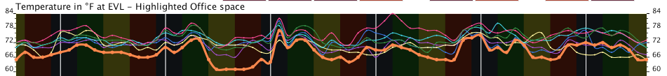
It shows temperatures readings and averages of different rooms at EVL. The user can change the view when interact with the buttons on the screen.
![]()
![]()
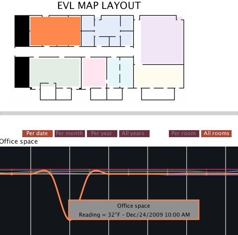
These buttons can show/hide visual features in the graph.
" Per date, Per month, Per year, All years" : change the range of dates to visualize in the graph.
" Per room, All rooms": show the data of one room that will match with the one highlighted in the MAP layout, or shows all the rooms in the same graph.
" Show in C, Show in F": show the temperatures in the measurement unit selected.
"Show UIC Events" : plot the start and end of each session at UIC. (Summer, Fall, Spring).
"Show seasons" : draw the seasons as a background in the plot area using different colors per season.
"Outside Temp.": plot the daily or monthly averages of the chicago area.
"Hourly, Daily, Monthly": plot the data according to the selected button.
Although the view by hour per year can or month cannot draw a perfect line, it is useful to get an idea of min and max temperature values, and also help to identity odd readings.
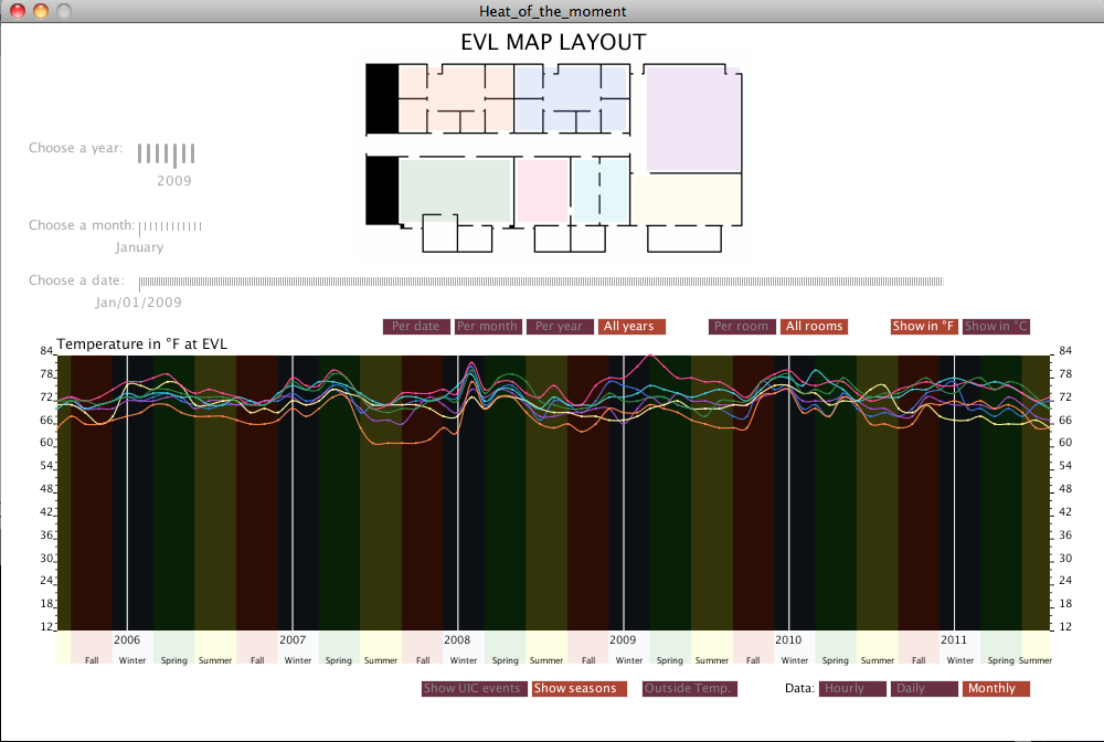
The sliders will help the user to select a specific day, month or year. It was designed in this way becuase it helps to compare the same date or month in different years. For example the user can choose January as month, and start moving through the years. The graph will update acording to the year. So, it will be easy to see changes in trends by month or days if desired.
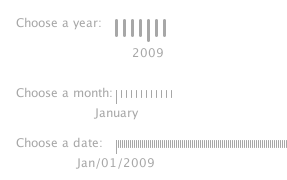
Additionally, the user can see details of specific points, when the pointer of the mouse is close enough. This feauture helps a lot, when we have the hourly view or we are observing all the rooms at the same time. The color in the layout, and line graph will match the frame color in the details.
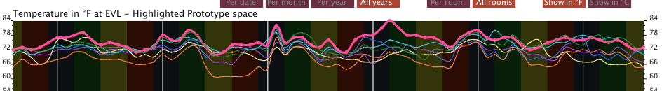
The visualization of all rooms at the same time helps the user to identify which are the cooler or warmer rooms. When all rooms are in the graph, the application allow to select one of them by clic on the map. The active or selected room will be plotted in a thicker line. At the same time, the name of the room will appear in the graph title. So, the user can identify the room easily.
Data Observed using the visualization tool.
From the graph we can see:
At the beginning of each Spring semester the temperatures in the rooms tends to decrease.
At the beginning of the Winter time the temperatures in the rooms tends to increase and change when the spring semester start. The transition between Winter and Spring (beginnig of March) it is when more changes can be perceived.
At the beginning of the Summer time the temperatures tend to decrease.
Prediction of montly temperature.
The application also gives an estimate of the readings for the next months. When the user select a month in the future for the present year. The user can generate an estimate temperatures that will be print in the console when it clic on the button "Save predictions".
The predictions generated for October and November 2011 are:
Room,October temperature, November temperature.
3B00080058124B10,75,76
73000800B1D9BD10,74,72
DB000800B1E8E710,72,68
F2000800B1D88510,76,78
35000800B1EC2510,78,76
DB00080041634E10,79,76
FF00080057FB1810,72,72
As in the graph by year, it can be observed that there is not significant change in the temperatures per month (there are some exceptions). It is understood that we have in the graph a seasonal model with trends. The formula for the prediction assume that the average of the previous year will be affected by an average PE. Prediction = Previous year average * average PE
Where PE =(Previous year reading - Current year reading)/Previous year reading. The application compute the average of all PE considering all years in a specific month.