Project 1: Heat of the moment.
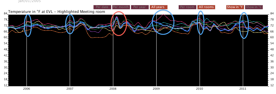
The way in which the data is plotted in the graph, allows the user to see interesting things in the data. Examples:
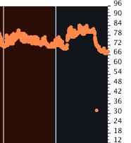
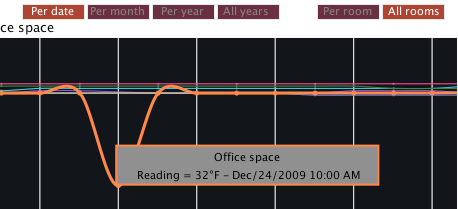
The view of the data by hour help the user to see interesting readings. Such as the one at 24 Dec 2009 at 10:00AM.
Although this view does not give a well define curve or line, helps to get an idea about min an max ranges or temperatures and odd readings as the one in the picture.
The view of all years also helps to determine changes in the trends. For example the beginning of 2008. The graph shows an unusual increase in the room temperatures. Also, In 2009 it is observed a considerable increase for only one of the rooms. The picture shows and highlight the readings at the b`eginnng of each year.